

Art Direction: Katey Stafford
Mock Ups: Adobe Stock
PRESTO
Presto is a new drive thru that serves fresh pasta faster than ever. The goal of the brand was to make a pasta drive through restaurant that is inviting to all. Our simple icons make it more accessible to people to understand different pasta shapes if they are not familiar with them. Overall the goal of this brand style makes deliverables easy to read and the process very simple while the customers order.

Logo Process
At first I was going for a more decorative typeface to try to match the unique Italian style. However, I felt like this restaurant was more focused on introducing people to great Italian food. So, I decided to go towards a modern style that’s simple and accessible.

First Stages

Final Logo
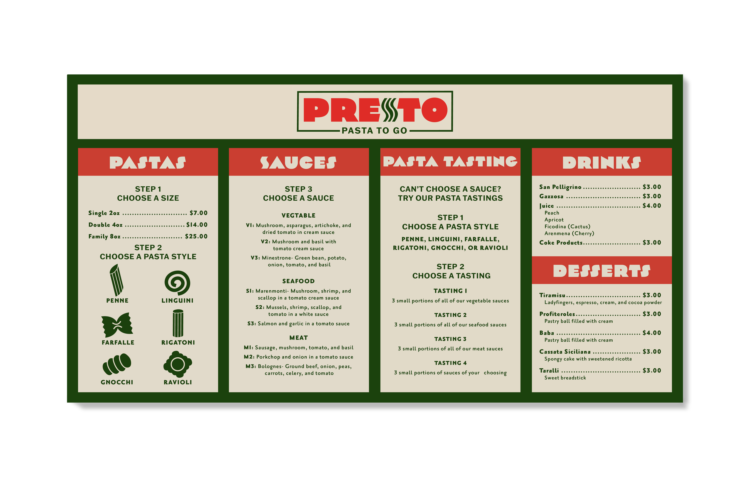
Drive-thru Board
For the drive-thru board I wanted to focus on a clean and accessible style. For the pasta shapes, some people might not understand what some are. So, adding icons so they know what each shape looks like is very helpful for the audience. Each step is also very clear throughout the ordering process, so there is no room for confusion for the consumer.
Pins, aprons, posters, and stickers include a series of pasta icons and logo lockups.


